Onboarding: Designing for Two Very Different Advertisers
Context
Our ad platform didn't start as a standalone product — it grew out of necessity. Our core business was a consumer news app, and as our user base grew, advertiser demand grew with it. For years, we relied entirely on third-party networks to fill that demand. It wasn't a good arrangement: the best inventory was often quietly routed to the network's own advertisers first, take rates were high, and we had no real leverage. At the same time, user feedback was telling us the ads showing up in our own product weren't good.
That's when we decided to build our own ad platform from the ground up. I asked to be part of it from day one, largely because I'd been living inside the ad experience as a consumer product designer and had strong opinions about what wasn't working.
Starting From Nothing
There was no onboarding in the MVP. Users filled in the bare minimum — account and payment details — and landed straight in the main product to figure things out on their own. We had no external users to research; in the earliest days, we leaned on our sales and operations teams' frontline knowledge of the ad business to make design decisions in place of formal user research.
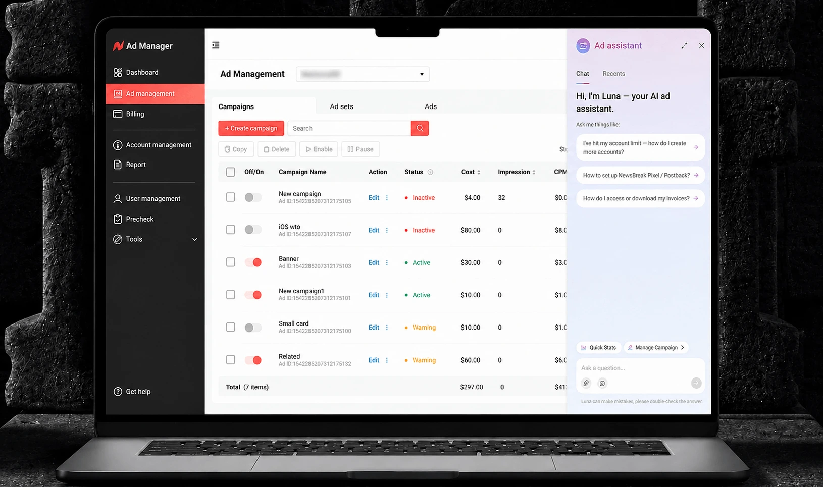
The first real signal that this wasn't working came from our Affiliate advertisers — typically larger accounts — who churned or complained because the platform had no entry point for the advanced capabilities they needed: multiple accounts, tracking, bulk operations. SMB advertisers were quietly struggling too, but the Affiliate pain surfaced first and hit revenue hardest.
Three Attempts to Get It Right
Finding the Real Segments
The answer came from research, not instinct. Through user surveys, data analysis, and conversations with our operations team, we found that different advertiser groups had fundamentally different onboarding needs — not just different preferences, but different levels of product complexity they could handle and different information they needed to succeed.
As design lead on the onboarding project, I proposed — and worked through with PM and engineering — a shared framework with role-based branching, rather than two entirely separate systems or a quick patch for Affiliate alone. We rejected the "just patch Affiliate" option specifically because it would only solve today's problem; as the platform grew, we knew we'd eventually have more advertiser types than just these two, and we needed an architecture that could extend, not one we'd have to redo.
The Final Flow
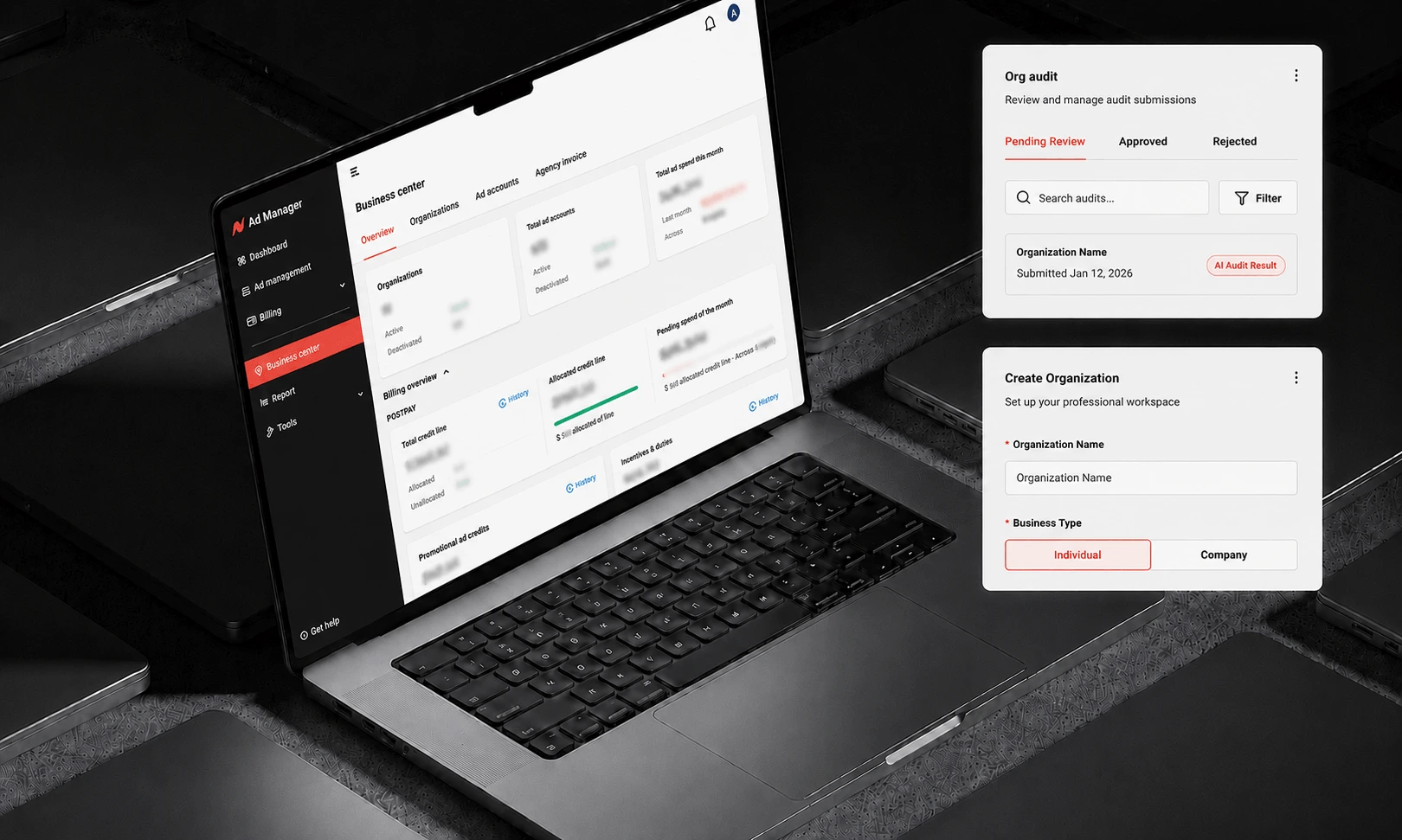
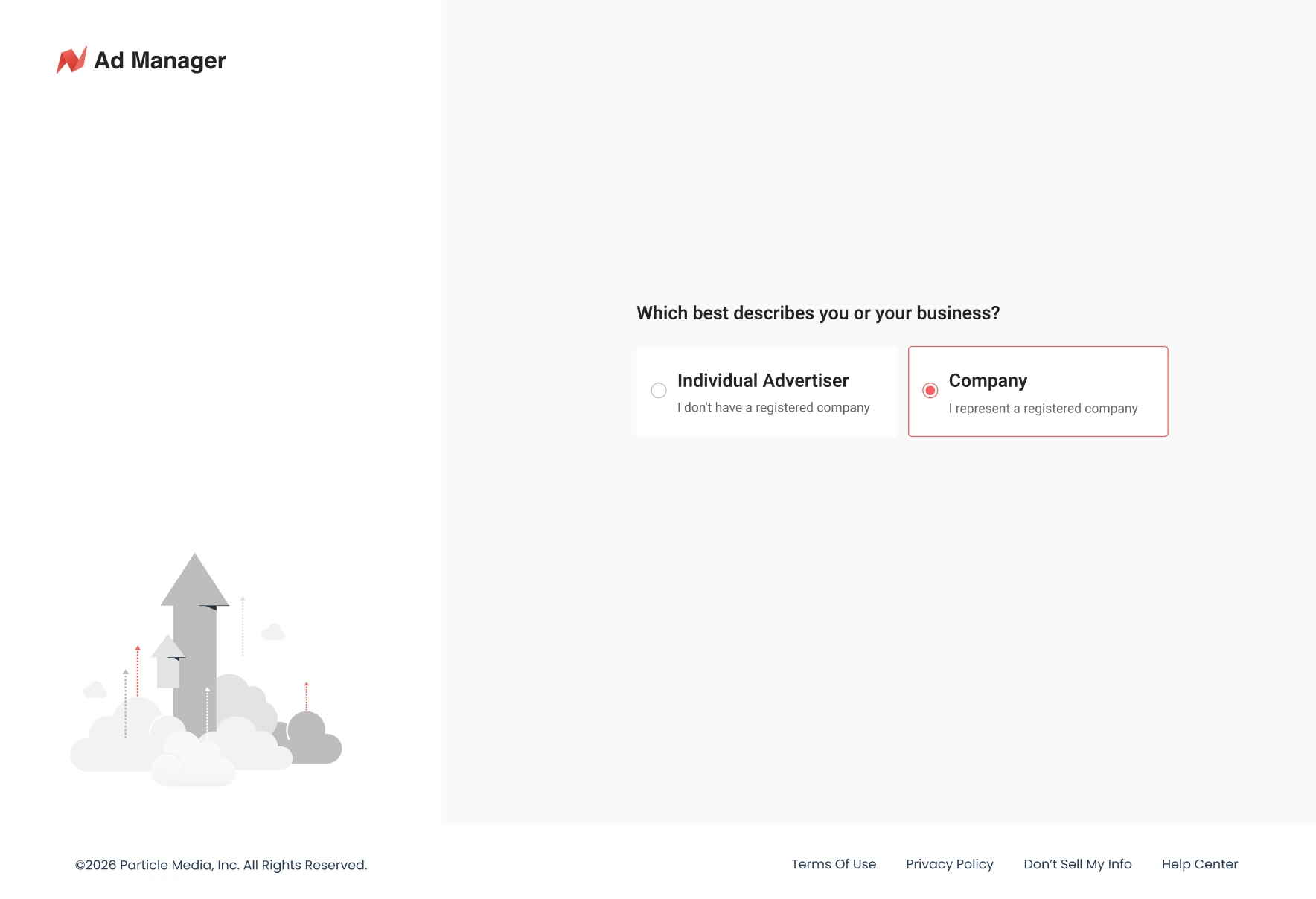
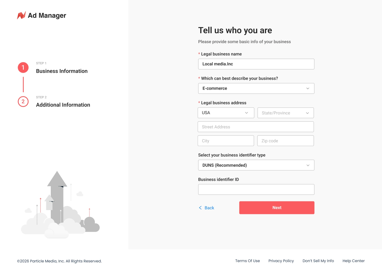
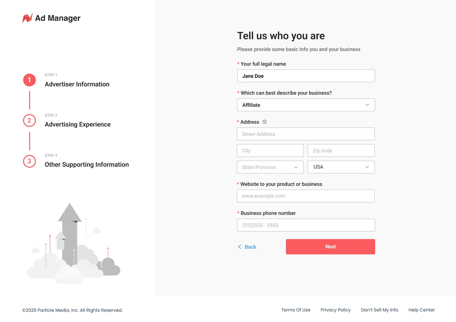
Account type. At signup, advertisers self-select as SMB or Affiliate, determining which form they see next — simplified for SMB, advanced (multi-account, tracking, bulk tools) for Affiliate. Because self-selection carries a risk of choosing wrong, I built in a safety net: users can switch account type and unlock the corresponding features at any time from settings.
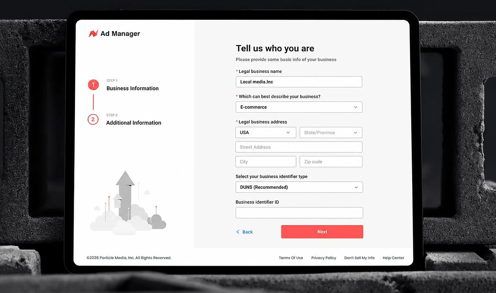
Business category. Independent of account type, every advertiser also selects a business category — App Install, Lead Gen, Gaming, E-commerce, and others — as part of the same form. Account type shapes how much complexity a user can handle; business category shapes what content and guidance is actually relevant to them.
A tailored welcome. After the form, users land on a welcome page built around their business category — a short, deck-style set of tips, developed with our operations team, highlighting what advertisers in that category should focus on first.
In-product guidance. Beyond the initial flow, I designed ongoing, role-differentiated guidance inside the product itself — contextual tips that help each user type find relevant features faster, rather than one generic tour for everyone.
Closing the Activation Gap
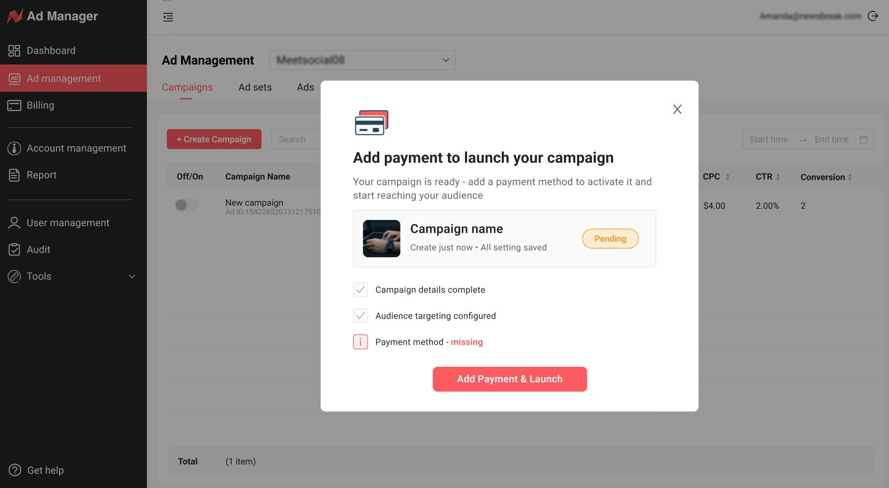
Getting users through onboarding wasn't the same as getting them fully active. We noticed advertisers completing the initial flow but still not finishing the steps that actually mattered — setting up a payment method, setting up event tracking, and creating their first campaign.
Rather than force all three into a single mandatory sequence, which we knew from the long-form experience would hurt completion, I designed a lighter, persistent floating prompt that stayed visible without blocking the user, plus contextual triggers — for example, if a user reached the final step of creating their first campaign without a payment method on file, the flow would surface a payment setup prompt at exactly that moment.
Outcome
Completion of key activation steps improved measurably after the final system launched, and the Affiliate churn that first got the team's attention subsided as those advertisers finally had a path suited to how they actually worked. Across the iterations, customer satisfaction with onboarding rose from 2.5/5 to 4/5 — the payoff of treating each version as a hypothesis to test against real feedback rather than a final answer.
What This Taught Me
The biggest lesson wasn't the final flow itself — it was how many wrong-but-reasonable answers we tried before we got there. "Collect everything up front" felt efficient. "Just fix the loudest complaint" felt fast. Both were wrong because neither was built on evidence of what different users actually needed. The design that worked only came from treating onboarding as a research problem first and an interface problem second.